This guide is your manual for embracing the spirit of Wetopia Coliving: A Place for Personal Growth. We believe in the power of community to improve lives, foster connections, and embrace diversity. Everyone, regardless of their background, is welcome, and we're committed to making sure you feel valued and respected.
We are Wetopia Coliving – we're the experts of shared living, dedicated to making modern living not just better but, dare we say it, more fun!
Our mission? To create spaces that turn neighbours into friends, and where life isn't just shared but thoroughly enjoyed. So, if you've ever wondered if co-living could be a blast, you're in the right place!

Our mission? To foster deep connections, inspire collaboration, and offer unwavering support in a setting that's not just inclusive but also loads of fun.

At Wetopia, inclusivity isn't just a buzzword; it's how we roll. We're all about creating a warm, welcoming space where everyone, regardless of their background, feels valued and cherished.

We're committed to providing a secure environment that goes beyond just physical safety – it's about your emotional and mental well-being too.
At Wetopia, we raise a toast to diversity and say no to any form of bias. It's all about inclusivity, equality, and embracing the unique tapestry of our community – because different is beautiful!

Our mission? To foster deep connections, inspire collaboration, and offer unwavering support in a setting that's not just inclusive but also loads of fun.

Say goodbye to the hassles of everyday life. We're all about keeping it simple and stress-free. With Wetopia, you can focus on what truly matters while we handle the rest. It's living made easy.

Your well-being is our top-dog, top-hat priority. We're not just about comfy sofas and swanky kitchens; we're your well-being cheerleaders. Dive into amenities, activities, and resources that make you feel zen, healthy, and balanced – because, let's face it, a happy resident is our kind of resident!

We believe that living in a community can be a powerful catalyst for personal growth. We aim to create environments that inspire residents to learn, evolve, and unlock their full potential.
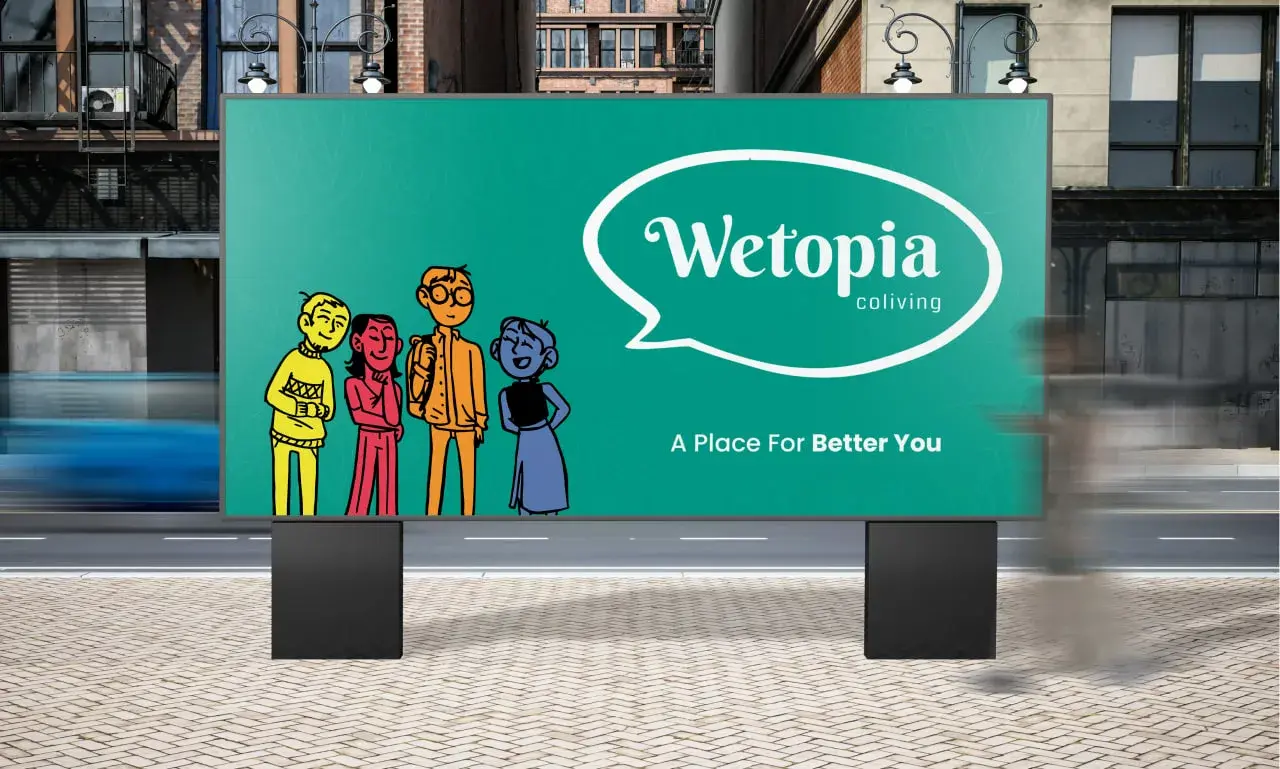
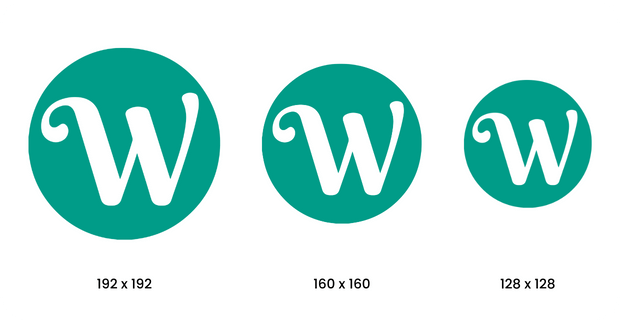
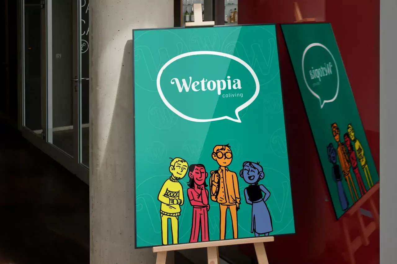
The main logo is like the superhero cape of our brand, always ready to swoop in whether we're tackling co-living conundrums, navigating the roommate maze, or just hosting a friendly get-together.
But, let's be honest, even superheroes need their beauty rest. So, it's important to pamper our logo like it's having a spa day. After all, we wouldn't want our logo to pull a grumpy face while co-living, right?
![]()
![]()
![]()
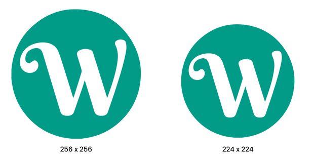
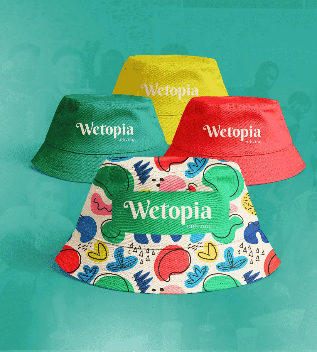
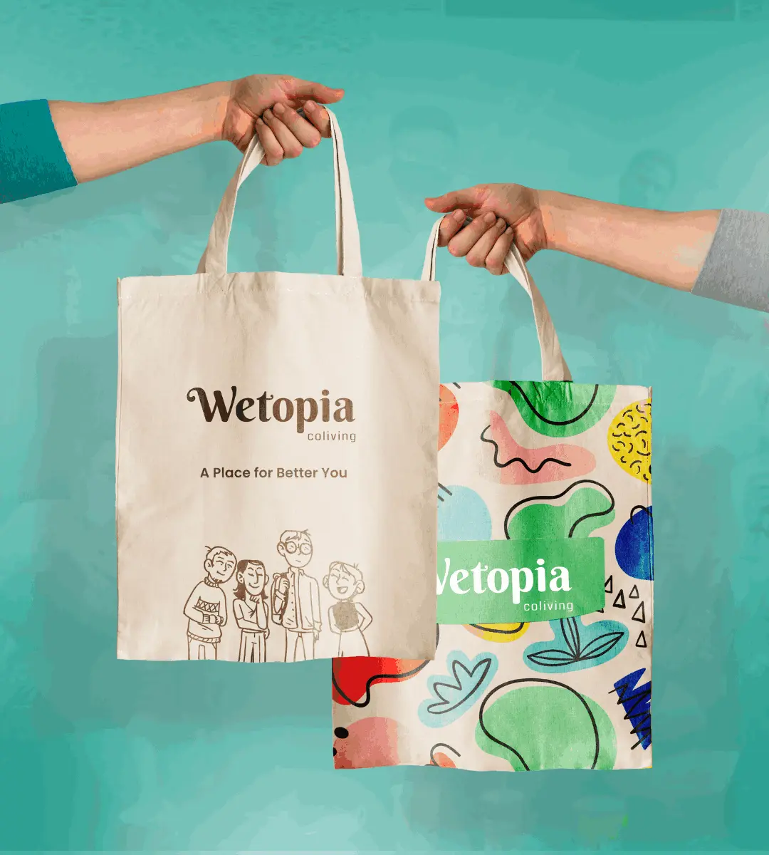
Think of isotypes as the reliable roommate in our branding adventure, always present on business cards, swag, and all our promotional goodies.
Like that roomie who never forgets to restock the shared fridge with your favorite snacks, isotypes are there to back us up and ensure our brand is coliving at its best! They come in both solid and keyline formats, because in the world of branding, versatility is key, just like the coliving lifestyle.
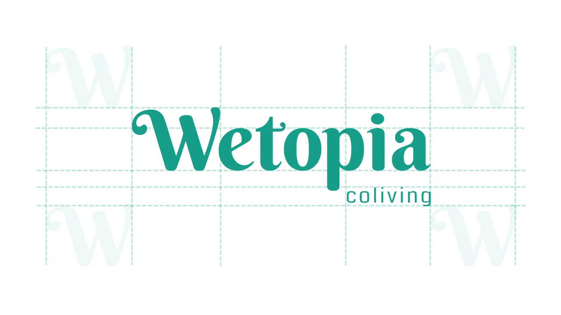
Imagine not mixing and matching your socks – one yellow and one brown. Just as you wouldn't want a fashion faux pas, we at Wetopia believe in keeping things stylish yet relaxed. While we're not big on strict rules, here are some fun guidelines for keeping our vibrant Wetopia spirit alive and well, and what we'd rather not see.
DO leave the logo some space to breathe.

DO NOT overcrowd the logo. Give it some room to breathe.

DO use it on a clean and minimalist photo.

DO NOT use the logo on busy and cluttered background.

DO use negative color on a dark background.

DO NOT alter the mark’s form in any way.

DO NOT mask busy textures within the wordmark.

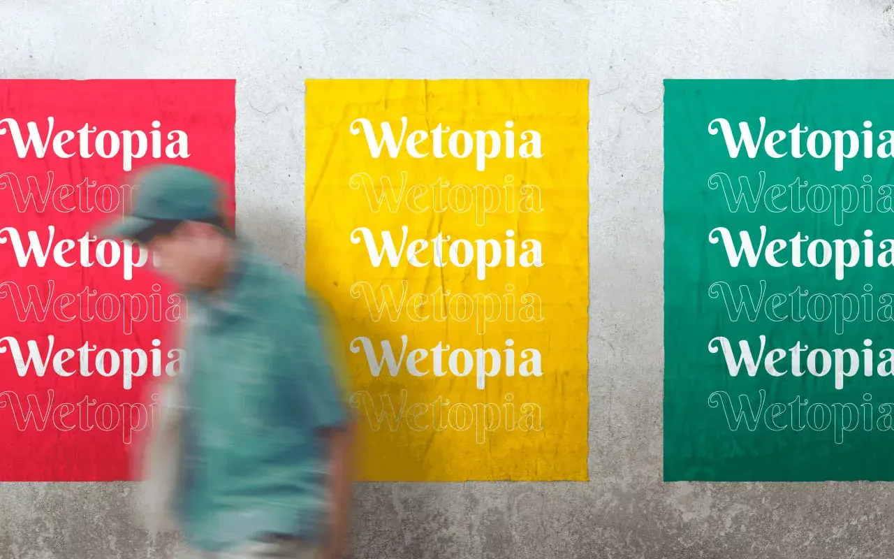
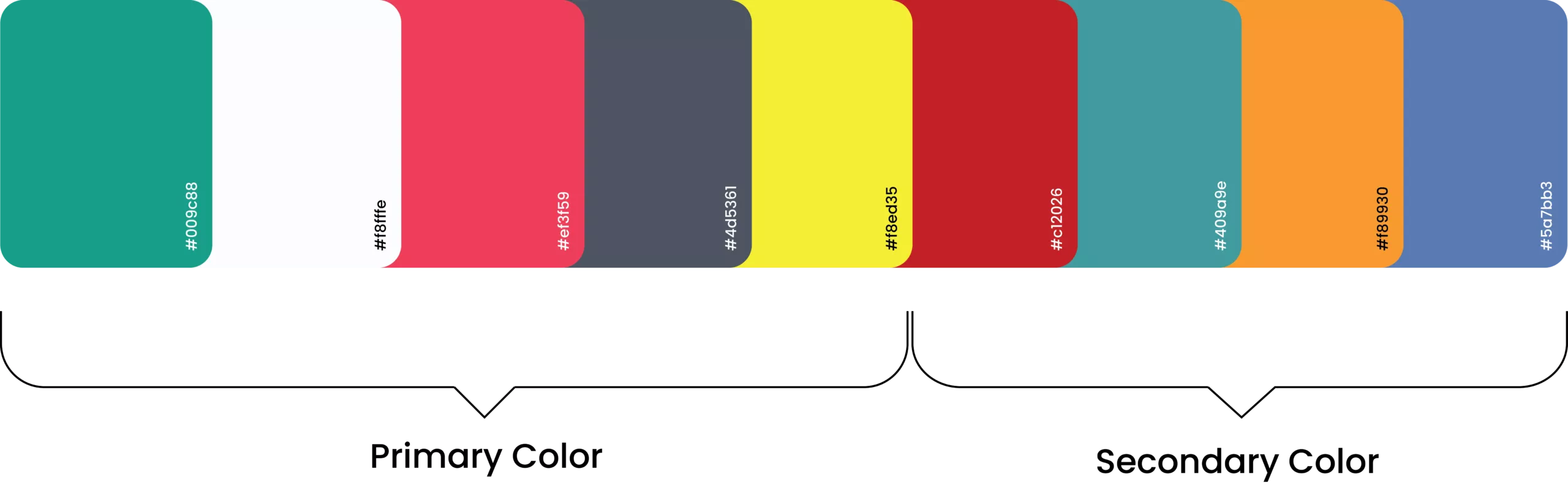
For marketing shenanigans, our logo can rock a rainbow of colors, as flaunted right here.
This wild spectrum not only tickles the fancy of our designers but also sets the stage for an epic color party when mingling with illustrations or photography. Let's paint the town (or at least our designs)!
![]()
![]()
![]()


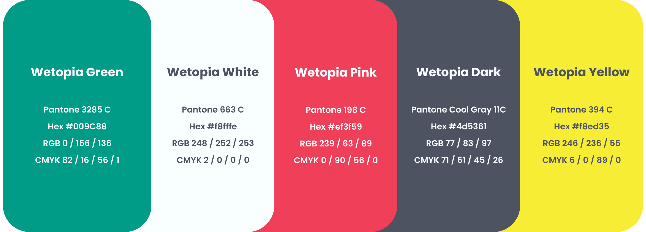
Wetopia Green : Wetopia is often associated with nature, growth, and harmony. It symbolizes freshness, health, and sustainability.
Wetopia White : White created a sense of elegance and minimalism as it can appear modern, clean, and sophisticated.
Wetopia Pink : Pink signify playfulness and creativity as it shown related to love, care, or creativity.
Wetopia Dark : Dark gray is a neutral and timeless color. It suggests sophistication, professionalism, and seriousness as Wetopia convey trustworthiness and a sense of reliability.
Wetopia Yellow : Yellow mean full of positivity, happiness, and optimism as Wetopia aims to stand out, inspire confidence, or evoke a sense of joy.
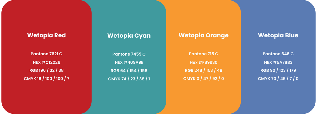
Wetopia Red : Bold and attention-grabbing color. It's linked to passion, excitement, and action.
Wetopia Cyan : Refreshing and tranquil color. It symbolizes calmness, balance, and clarity.
Wetopia Orange : Represents enthusiasm, creativity, and adventure.
Wetopia Blue : Building trust, reliability, and professionalism as Wetopia create a sense of security and dependability.
Our typefaces are more than just pretty characters; they're the secret sauce that ensures our brand message is read loud and clear, even if you're reading it from your cozy coliving space while juggling a remote job, a coffee mug, and the occasional game of ping-pong in the common area.
Our main font, Poppins, is like the friend who's always up for an adventure, just like the coliving lifestyle we adore. With its modern-yet-timeless vibe, it's the perfect match for showcasing our brand's spirited personality – because living together is just more fun (and font-tastic!) when you're in Wetopia.
Our secondary typeface is Anton, a font that's as bold as the person who suggested we try coliving.
Anton doesn't just share space on the screen; it colives with your content, turning every word into a roommate you can't ignore. It's like the font version of your quirky neighbor who insists on borrowing your lawnmower and then brings you homemade kombucha as a thank-you gift.
With Anton, our messages will colive with your eyeballs, making them laugh, cry, and maybe even consider sharing their screen with some font friends.


Our mission? To foster deep connections, inspire collaboration, and offer unwavering support in a setting that's not just inclusive but also loads of fun.

Friendliness is at the heart of Wetopia Coliving's personality. It goes the extra mile to create a warm and inviting atmosphere, where residents and staff are always ready to lend a helping hand and share a friendly chat.

The brand actively promotes inclusivity, ensuring that every resident feels valued and respected. Wetopia Coliving celebrates diversity and encourages everyone to contribute to the vibrant community.